Charts
Longitudinal charts
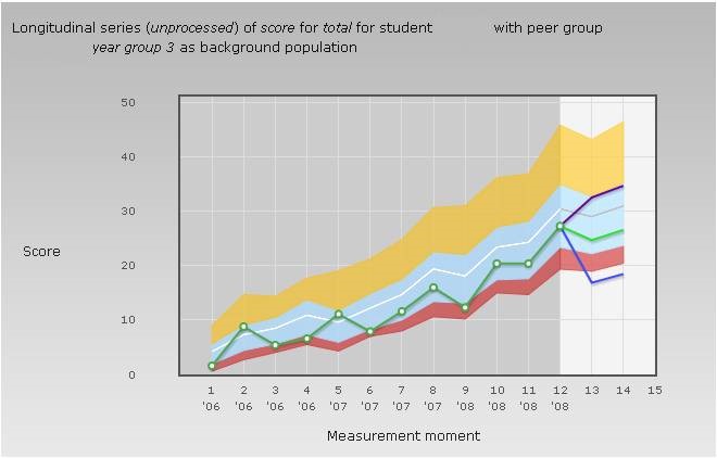
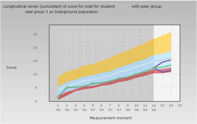
A longitudinal chart presents the scores on a series of PGTs, providing information about the development of knowledge (in general and for different subdomains). The scores in the series represent the nominal measurement moments, that is, if a student repeats a specific test (for example the second year March test) only the score on the most recent test is shown in the chart. In addition to the actual scores, a prognosis for one or two future tests is also presented. The chart can present the actual scores or the cumulated scores. In the latter case the development of the scores is more gradual, because for each point on the chart the mean score up to and including that point is presented.
The longitudinal chart is composed of the following parts:
- A green line showing the development of the scores, with white dots representing the actual test scores; a missing dot indicates the absence of scores for that particular test.
- Coloured areas indicate the score distribution of the reference group. The coloured areas do NOT indicate the distribution of the insufficient, sufficient and good scores. The red area, for instance, always represents for each measurement moment 10% of all scores, irrespective of the size of the area. If the area is relatively large this merely indicates that the bottom of the distribution (from the fifth to the fifteenth percentile) is long drawn out. If many scores coincide (for instance many 0 scores in a subdomain that is very difficult for first year students) both the fifth and the fifteenth percentile can be 0, and the red area is reduced to a line.
- The lighter background on the right of the chart indicates the prognosis area. The green line represents point estimates of the prognosis and the blue and purple lines indicate the 95% confidence interval.
For comparison the longitudinal chart of the cumulated score is also presented. This chart shows a gradual development with less impact of noise and thus gives a better representation of the growth of knowledge.
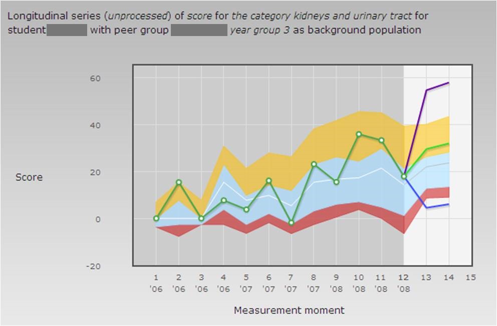
Growth of knowledge for different subdomains can be represented by similar charts for each domain. Below we present a chart showing the raw and the cumulated score development of a student for the kidneys and urinary tract. Due to the small number of questions on which the subtest results are based the disturbance due to noise is even stronger than with the total score. As a result, the cumulated score provides a much more reliable picture of the growth of knowledge.

Momentaneous charts
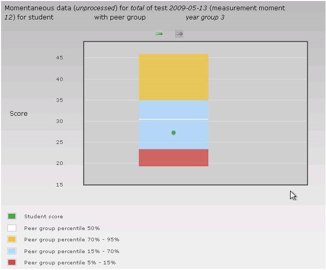
A momentaneous chart provides information on the scores of one specific progress test. The chart presenting the total score consists of two parts: 1. A green dot indicating the student’s score level (on the vertical axis). 2. A box indicating the score distribution of the reference group. The box represents the percentiles of the score distribution in the reference group. The box is NOT a bar chart in which the sizes of the coloured areas indicate the percentage of insufficient, sufficient and good scores. The red area always represents 10% of the scores, irrespective of its size. A relatively large red area merely indicates that the bottom of the distribution (from the fifth to the fifteenth percentile) is relatively drawn out. If many students have the same score (for example zero on a particular subdomain that is very difficult for first year students) both the fifth and the fifteenth percentile are 0 and the red area is reduced to a line.
A chart representing scores on different subdomains shows as many horizontal bars as the subdomains that are represented. Areas of different colours in the bars indicate the score distribution of the reference group (in this case the corresponding scores are indicated on the horizontal axis). A green dot in each bar indicates the score of the individual student.
Go back to the page ‘Basic concepts’
-

Go to ProF to get feedback on your test results
Go to ProF